Color Basics: Hue, Tint, Tone, and Shade
Ever hear an artist talk about 'tones' and 'shades' and just... nod along? You're not alone. These words get tossed around like salad, but they have specific meanings.
Let's cut through the jargon. This isn't a stuffy art lecture, it's a simple guide to the basic building blocks of color. Once you get these, you'll see them everywhere.
The Big Four: Hue, Tint, Shade, and Tone
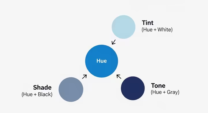
It all starts with the hue. A hue is just the pure, basic color, think red, blue, or yellow. It's the 'parent' color, straight out of the crayon box, with nothing mixed in yet.
While we call almost anything a "color," a hue is technically only the pure version. For example, navy and sky blue are both colors, but their parent hue is just... blue. Simple.
Creating Tints, Shades, and Tones
Once you have your pure hue, you can start mixing. Add white to a hue, and you get a tint . Red + white = pink. Tints are lighter and paler, what most people call pastels.
Add black to a hue, and you get a shade . Red + black = burgundy. Shades are darker and deeper. (Yes, this means all those paint swatches at the hardware store aren't really 'shades' of green. Mind blown?)
Add gray to a hue, and you get a tone . This mutes the color, making it less vibrant and more subtle. Most colors you see in the real world are tones, like the grayish-green of distant trees or the muted blues of a cloudy sky.

A Quick Cheat Sheet
So, to recap... Hue is the parent. Tint is the parent plus white. Shade is the parent plus black. And Tone is the parent plus gray.
| Term | What You Add | What Happens | The Vibe |
|---|---|---|---|
| Hue | Nothing (It's pure!) | Stays super intense | Vibrant, Pure |
| Tint | Add White | Gets Lighter | Pastel, Soft, Airy |
| Shade | Add Black | Gets Darker | Deep, Dark, Somber |
| Tone | Add Gray | Gets Muted / Less Intense | Subtle, Complex, Natural |
How It Actually Works
Knowing the definitions is one thing, but *why* does this happen? It comes down to two other properties of color: value and saturation. Don't worry, it's not as complicated as it sounds.
Value and Saturation
Value is just how light or dark a color is. Imagine a black-and-white photo, that's all about value. Adding white to a hue makes a tint and raises its value (makes it lighter). Adding black makes a shade and lowers its value (makes it darker).
Saturation is the color's intensity or purity. Think of the color setting on a TV. Crank it up, and you get super-vibrant, highly saturated colors. Turn it all the way down to black and white, and you have zero saturation.
Here's the key rule: a pure hue is always at max saturation. Anytime you mix it with white, black, or gray, you are always lowering its saturation. That’s why a pastel pink (a tint) feels softer than fire-engine red.
Color on Screens vs. on Paper
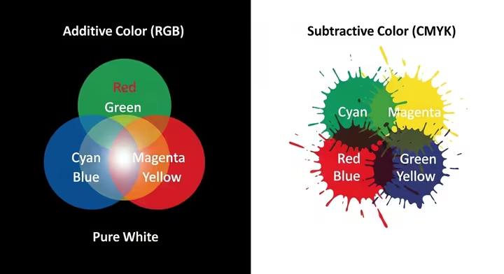
This all plays out differently depending on if you're looking at a screen or a painting. Screens use the Additive (RGB) model. They start with a black screen and *add* Red, Green, and Blue light together. All three at full blast make pure white light.
Paint and ink use the Subtractive (CMYK or RYB) model. They start on a white surface and the pigments *subtract* or absorb light. The more paint you mix, the darker it gets, usually heading toward a muddy black. (This is why mixing all your Play-Doh as a kid was always a bad idea.)

Okay, But How Do I Use This?
With a Paintbrush
When you're mixing actual paint, these concepts are your best friend. To make a tint, add white. A shade, add black. A tone, add gray. Easy enough.
Hot tip: Always, always, *always* add a tiny bit of the dark color to the light color. A speck of black paint can destroy a whole tub of yellow, but not the other way around. Trust us, this will save you a lot of paint and frustration.
On a Computer
Digital art makes this even easier, no mess involved. In apps like Procreate or Photoshop, you'll see a color picker with HSB (Hue, Saturation, Brightness) or HSV (Hue, Saturation, Value) sliders.
The 'H' slider picks your pure hue. The 'S' and 'B' (or 'V') sliders do the rest. To make a tint, you lower saturation and raise brightness. To make a shade, you just lower the brightness.
In Everyday Design
This stuff is everywhere once you look for it. Interior designers use light tints to make small rooms feel bigger and more open. Fashion designers use deep shades and earthy tones for moody autumn collections.
Even a brand's logo might use a bold, pure hue, while its website uses tints and tones of that same color to look clean and professional. It's all about creating a consistent vibe.
Making People Feel Things (And Drawing a Decent Apple)
So why bother with all this? Because it lets you control the mood and make things look real. It's how you turn a flat canvas into something with feeling and depth.
Color and Mood
You can guide how someone feels just by the colors you choose. Palettes full of tints feel light, peaceful, and calm. We connect them with soft morning light and open skies.
A palette heavy with shades feels dramatic, mysterious, and serious. These are the colors of twilight and deep shadows. Meanwhile, a palette built on tones feels more natural, sophisticated, and realistic, because pure, screamingly-bright hues are actually pretty rare in nature.
Painting a 3D Apple
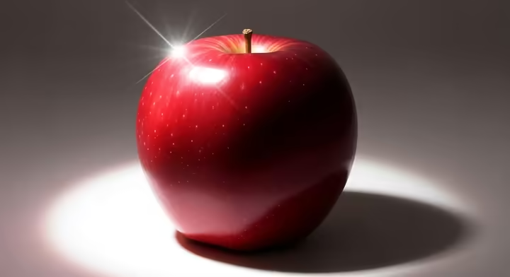
Let's paint an apple. You don't just use one tube of red paint. First, you start with the apple's main color, its hue , which is red.
The spot where the light hits hardest is the highlight , which you'd paint with a tint (red + white). The side turned away from the light is the form shadow , made with a shade (red + black, or maybe a dark green for a more natural look).
Everything in between shows the curve of the apple. These are the mid-tones , a mix of different tones of red. Bam. A flat red circle just became a round, 3D-looking apple.

Things People Always Ask
Is black a color?
Depends who you ask! In physics, no, it’s the absence of light. But in painting, you bet it is. You can buy a tube of Mars Black, so it's a color. It's also the *agent* you use to make shades.
What about white?
Same deal. In the physics of light, white is all colors combined. In the world of paint, it’s a pigment like Titanium White. It's both a color on its own and the agent you use to make tints.
What's the difference between a shade and a shadow?
This one is super important. A shade is the darkness *on* the object itself (the dark side of our apple). A cast shadow is the area of darkness the object throws *onto another surface* (the dark blob the apple makes on the table).
The Room Analogy
If you remember just one thing, make it this. Imagine you're in a room painted one pure, bright color. Let's say... fire-engine red. That pure color is the Hue .
Now, someone turns on bright white floodlights. The red on the walls looks much paler, almost pink. That washed-out look is a Tint .
Next, kill the floodlights and turn the main lights way down with a dimmer switch. The red deepens into a rich, dark burgundy. That's a Shade .
Finally, the lights go back to normal, but you put on a pair of gray sunglasses. The red is still red, but its intensity is gone. It looks duller. That's a Tone .
That's it. You now know the basics. The best way to learn is to mess around, mix some paints, play with color pickers online, and start noticing the tints, shades, and tones all around you. Go have fun.
Works cited
- What Is the Difference Between Tints, Shades, Hues, and Tones ..., https://creativemarket.com/blog/tint-vs-shade-hue-tone
- The Ultimate Guide to Understanding Hue, Tint, Tone and Shade, https://color-wheel-artist.com/hue/
- color-wheel-artist.com, https://color-wheel-artist.com/hue/#:~:text=In%20painting%2C%20the%20word%20COLOR,families%20on%20the%20Color%20Wheel.
- Color, Hue, Tint, Tone, and Shade - Beach Painting Contractors, https://www.beachpainting.com/blog/color-hue-tint-tone-and-shade/
- Hue vs color: the most important difference explained - Oleander studios, https://www.oleanderstudios.com/hue-vs-color/
- Understanding Color Schemes & Choosing Colors for Your Website - Web Ascender, https://www.webascender.com/blog/understanding-color-schemes-choosing-colors-for-your-website/
- www.khanacademy.org, https://www.khanacademy.org/humanities/special-topics-art-history/creating-conserving/painting-terms-in-action/v/moma-art-term-tint-shade-tone#:~:text=A%20tint%20is%20a%20color,%2C%20yellow%20ochre%2C%20and%20black.
- Tint, shade and tone - Wikipedia, https://en.wikipedia.org/wiki/Tint,_shade_and_tone
- Color Analysis & Seasonal Color Theory | Find Your Perfect Palette - Mystylebox, https://www.mystylebox.ca/pages/seasonal-color-theory-and-analysis
- Color tone terminology handbook: tint, tone, shade, and more - Linearity, https://www.linearity.io/blog/color-tone-terminology/
- Hue, Chroma, Tint, Shade and Tone - Matisse Paints, https://www.matisse.com.au/hue-chroma-tint-shade-and-tone
- The Art of Colour Mixing – 6 Key Tips for Oil Painting - Emily McCormack Artist, https://www.emilymccormack-artist.ie/art-of-colour-mixing-for-oil-painting/
- www.masterclass.com, https://www.masterclass.com/articles/value-in-art-explained#:~:text=Value%20is%20one%20of%20the,%2C%20focal%20point%2C%20and%20depth.
- Value in Art: Understanding the Use of Value in Art - 2025 - MasterClass, https://www.masterclass.com/articles/value-in-art-explained
- What Is Value in Art and Why Is It So Important? - Draw Paint Academy, https://drawpaintacademy.com/what-is-value-in-art/
- Color theory The Basics: tints, tones, and shades #becolorsmart - rebeccakshores.com, https://rebeccakshores.com/blog/color-theory-the-basics-tints-tones-and-shades-becolorsmart
- learn.leighcotnoir.com, https://learn.leighcotnoir.com/artspeak/elements-color/hue-value-saturation/#:~:text=Saturation%20is%20also%20referred%20to,color%20dominates%20less%20and%20less.
- Color Saturation - The Ultimate Guide for Artists - Draw Paint Academy, https://drawpaintacademy.com/color-saturation/
- color - What is the relationship between hue, saturation and value?, https://graphicdesign.stackexchange.com/questions/16166/what-is-the-relationship-between-hue-saturation-and-value
- Additive & Subtractive Color Models - PAVILION | DINFOS Online Learning, https://pavilion.dinfos.edu/Article/Article/2355687/additive-subtractive-color-models/
- Additive vs Subtractive Color: A Complete Guide - Arounda, https://arounda.agency/blog/additive-vs-subtractive-color-a-complete-guide
- The Difference between CMYK and RGB Color Models, https://www.colorvisionprinting.com/blog/the-difference-between-cmyk-and-rgb-color-models
- Subtractive vs Additive--phenomena or practical model : r/graphic_design - Reddit, https://www.reddit.com/r/graphic_design/comments/1k7nddn/subtractive_vs_additivephenomena_or_practical/
- What the Hell are RYB CMYK and RGB | by Amy Jackson - Medium, https://medium.com/@LearnBlogPhotography/what-the-hell-are-ryb-cmyk-and-rgb-b1529d764ca
- The RYB, CMYK, RGB, HSV and Hexadecimal Color Models, https://www.ferrum.edu/downloads/academics/programs/school_of_art_divisions/dept_visual/art-color-systems-handbook.pdf
- Advanced Color Theory: Color Wheels, Impossible Colors, & the Primary Color Debate, https://sarahrenaeclark.com/advanced-color-theory-ryb-vs-cmy/
- ELI5: Can you help me understand additive and subtractive color, and when/how each one happens? - Reddit, https://www.reddit.com/r/explainlikeimfive/comments/jvyldc/eli5_can_you_help_me_understand_additive_and/
- ELI5: The difference between RGB and RYB. : r/explainlikeimfive - Reddit, https://www.reddit.com/r/explainlikeimfive/comments/mhpa0t/eli5_the_difference_between_rgb_and_ryb/
- Color Theory for Artists- Part 1- What is Color? - Ann Richman Art, https://annrichmanart.com/blog/color-theory-part-1-how-do-we-see-color
- Understanding Color Spaces and Color Space Conversion - MATLAB & Simulink, https://www.mathworks.com/help/images/understanding-color-spaces-and-color-space-conversion.html
- Color Spaces in Image Processing - Scaler Topics, https://www.scaler.com/topics/color-spaces-in-image-processing/
- HSL and HSV - Wikipedia, https://en.wikipedia.org/wiki/HSL_and_HSV
- library.fiveable.me, https://library.fiveable.me/color-theory-and-application/unit-5/hsl-hsv-lab-color-spaces/study-guide/mvmPCReO2Qc4mJeS#:~:text=HSL%20and%20HSV%20use%20cylindrical,and%20consistent%20reproduction%20across%20devices.
- HSL, HSV, and Lab Color Spaces | Color Theory and Application Class Notes | Fiveable, https://library.fiveable.me/color-theory-and-application/unit-5/hsl-hsv-lab-color-spaces/study-guide/mvmPCReO2Qc4mJeS
- Oil Paint Mixing Guide - Understanding The Process - Zen Art Supplies, https://shop.zenartsupplies.co/blogs/toolkit/artists-colour-mixing-tips-for-oils
- Oil Paint Mixing Guide - Ran Art Blog, https://ranartblog.com/blogarticle04.html
- Color Adjustments — Procreate Handbook, https://help.procreate.com/procreate/handbook/adjustments/adjustments-color
- Make a small adjustment, or find a whole new vibe; the HSB sliders are a go-to #Procreate - YouTube, https://www.youtube.com/shorts/VCdeqPX20cQ
- HSB Sliders - YouTube, https://www.youtube.com/watch?v=t3_g3Z6OvUE
- Tints And Shades In Graphic Design: Best Practices And Applications - Vertex blog, https://vertex.art/blogs/tints-and-shades-in-graphic-design
- The Art of Tint in Color Design - Number Analytics, https://www.numberanalytics.com/blog/art-of-tint-in-color-design
- Tints, Tones and Shades in Interior Design - YouTube, https://m.youtube.com/shorts/Vlj8GlW6owA
- Colour in Interior Design: Part 1, https://interiordesignstudent.com/study-notes/colour-in-interior-design/
- Basic Color Theory Fashion Design 2025 - Affix Apparel, https://affixapparel.com/blog/color-theory-fashion/
- Discussion: Hues, Tints, Tones, and Shades. How do you approach colors in your capsule? : r/capsulewardrobe - Reddit, https://www.reddit.com/r/capsulewardrobe/comments/1foeadp/discussion_hues_tints_tones_and_shades_how_do_you/
- Tone in Art: Understanding Color Value – Naturalist Gallery of ..., https://naturalist.gallery/blogs/faq/tone-in-art-understanding-color-value
- The Impact of Colour Psychology in Visual Arts | Byard Art, https://byardart.co.uk/impact-of-colour-psychology-in-visual-arts/
- www.numberanalytics.com, https://www.numberanalytics.com/blog/ultimate-guide-to-tint-in-painting#:~:text=Tint%20can%20be%20employed%20to,sense%20of%20depth%20and%20distance.
- Tints - (Intro to Art) - Vocab, Definition, Explanations | Fiveable, https://library.fiveable.me/key-terms/introduction-art/tints
- Use Color Theory for Better Highlights and Shadows - The Virtual Instructor, https://thevirtualinstructor.com/color-theory-for-highlights-shadows.html
- Color theory - Wikipedia, https://en.wikipedia.org/wiki/Color_theory
- Exercises from 'Interaction of Color' by Josef Albers - Jeff Zych, https://jlzych.com/2020/04/29/exercises-from-interactions-of-color-by-josef-albers/
- The Difference Between Complementary and Analogous Color Schemes - Creative Market, https://creativemarket.com/blog/analogous-colors
- A Stanford ophthalmologist explains how we see color and art ..., https://stanmed.stanford.edu/a-stanford-ophthalmologist-explains-how-we-see-color-and-art/
- Misconceptions around psychology of color | by Anthony Kelly | UX Collective, https://uxdesign.cc/misconceptions-around-psychology-of-color-bd04b68c317d
- Are black and white colors? | Adobe, https://www.adobe.com/creativecloud/design/discover/is-black-a-color.html#:~:text=Some%20consider%20white%20to%20be,colors%2C%20they're%20shades.
- is black a color? : r/CasualConversation - Reddit, https://www.reddit.com/r/CasualConversation/comments/xgottv/is_black_a_color/
- color-wheel-artist.com, https://color-wheel-artist.com/hue/#:~:text=COLOR%20is%20the%20general%20term,referred%20to%20as%20a%20color.
- Shade and Shadow a in depth understanding | Sampratishta, https://sampratishta.org/shade-and-shadow/
- The Difference Between "Shade" and "Shadow" | Britannica Dictionary, https://www.britannica.com/dictionary/eb/qa/The-Difference-Between-Shade-and-Shadow-
- Create color swatches and tints, https://helpx.adobe.com/ee/illustrator/how-to/create-color-swatches.html